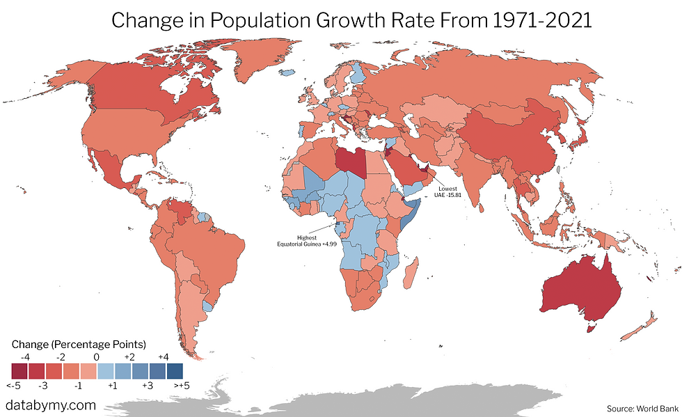
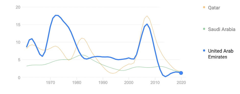
The world's total population recently passed 7.7 billion, so with so many people on our planet and new people being born every second, we thought it would be interesting to see if this rapid growth was slowing down anywhere by visualizing the change in population growth rate by country. From the above, you can see that very little countries are experiencing increases in their population growth rate. The largest decline in growth rate is seen in the United Arab Emirates, who's graph of growth rate sees two large spikes before returning back to lower levels.
In North America, there was no country that experienced an acceleration in its population growth rate, as well as Oceania. Australia in particular experienced one of the steepest declines(-3.2 percentage points).
Source: World Bank
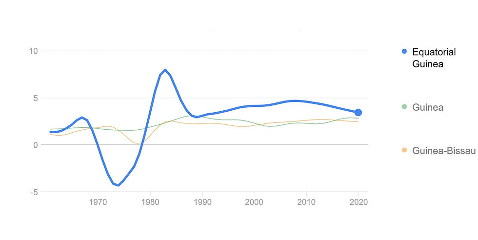
On the other hand, Equatorial Guinea experienced the largest increase, at just under 5 percentage points. This is what it's graph of population growth rate over time looks like:
What did you find most interesting about this map?
Comments